Primary · navy and cyan
The default on white and light paper. Proposals, reports, signage, invoices.
Logos, the Fletching, email signatures, business cards, letterhead and screen files. All drawn from the logo on martincommercial.com, in Martin navy and cyan.
Martin, set in heavy serif capitals and lowercase, with the cyan Fletching above it. Navy on light, white on dark. The horizontal version is new in this kit, for narrow headers.
Where these files come from. Martin's website serves its logo as a 901-pixel image, so the vector files here are a careful redraw of that file: the wordmark traced, the Fletching rebuilt from its measured geometry. Swap in the original artwork from Martin's designer when it arrives and every file on this page regenerates.
One solid vane and three barbs, split by the gap where the arrow shaft runs. Every diagonal sits at the same 38.7° angle. It is the favicon today and becomes the app icon and social avatar on a navy tile.




 App Store 1024
 Play 512
 Avatar 800
 Touch 180
 Android 192
 Favicon 32
 16
Store files are full squares with no transparency: Apple and Google round the corners themselves. The Play and avatar files shrink the Fletching so it survives a circle crop, and the favicon enlarges it so the three barbs still read at 16px. The icon pack also has favicon.ico and the bare mark in cyan, navy and white.
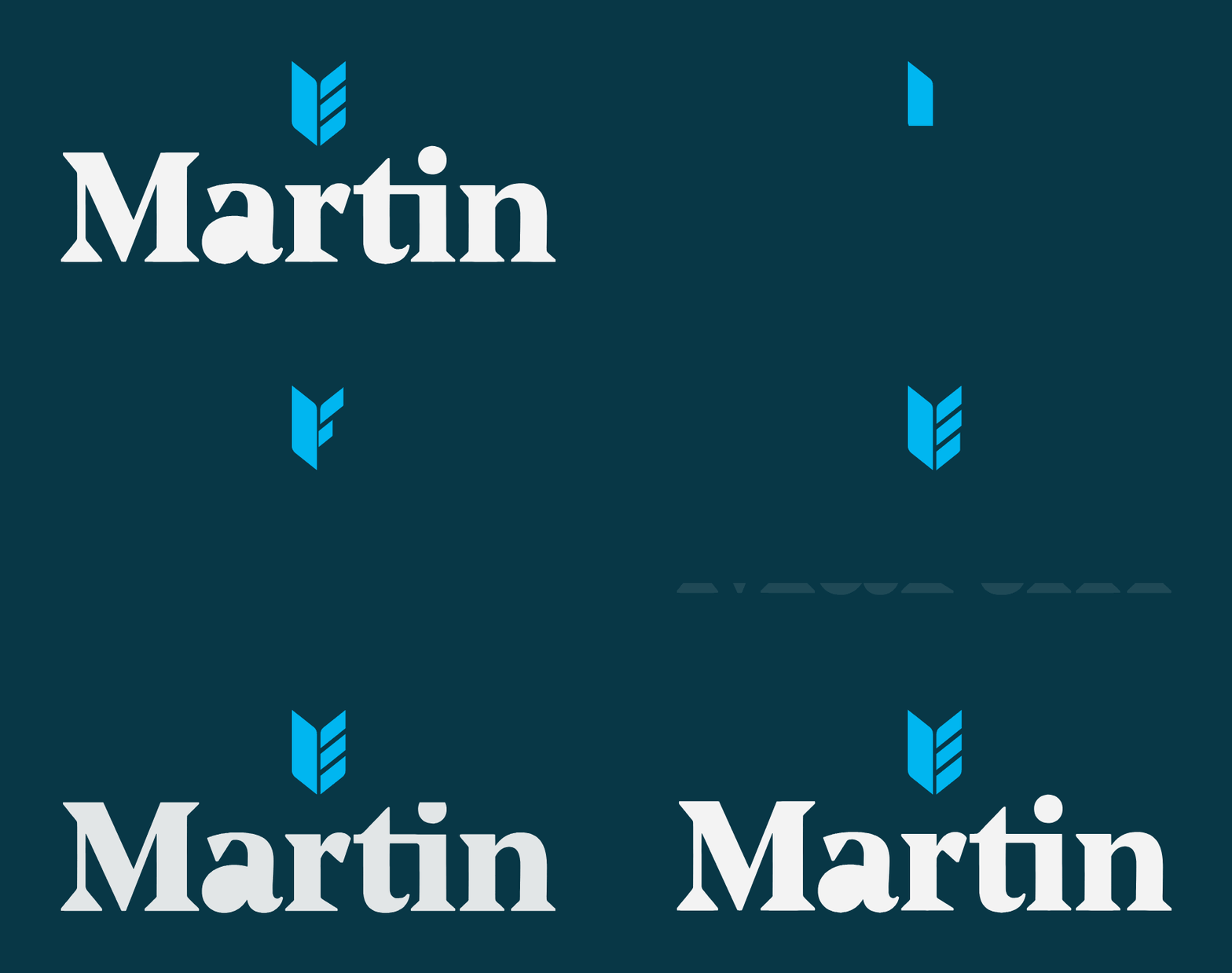
The vane drops into place, the three barbs sweep out from the shaft one after another, then the wordmark rises under them. It plays in every email signature and can open videos and the new site's header.
Martin Navy carries text and dark grounds. Martin Cyan is the Fletching, buttons and one highlighted phrase per headline. The first four are read from Martin's logo and site; the rest are added here so text passes contrast. Click a code to copy it.
Martin's brand faces are Noe Display for headlines and Objektiv Mk2 for text, both licensed through Adobe Fonts. This page and the files in the kit use DM Serif Display and Figtree, the closest free matches, until the licences are confirmed for the new site. Geist Mono sets the small uppercase labels. In email and Office they fall back to Georgia and Arial.
Type your details, check the preview, copy. The animated logo and photo are linked images, so the signature stays small and looks the same in every inbox.
Hi Sam,
Good to walk the site with you today. The floor plans and the leasing brochure are attached.
Before anyone pastes this: upload martin-logo-animated-email.gif and avatar-fallback-144.png from the email kit to the image host above. Until then the logo shows as a broken image in sent mail. The folder shown is a suggestion; any public folder on martincommercial.com works. The preview here uses this page's own copies.
The card preview follows the name, title, email and phone typed in the signature form above. The template PDF is print-ready with bleed; the printer or designer sets each person's details in it.
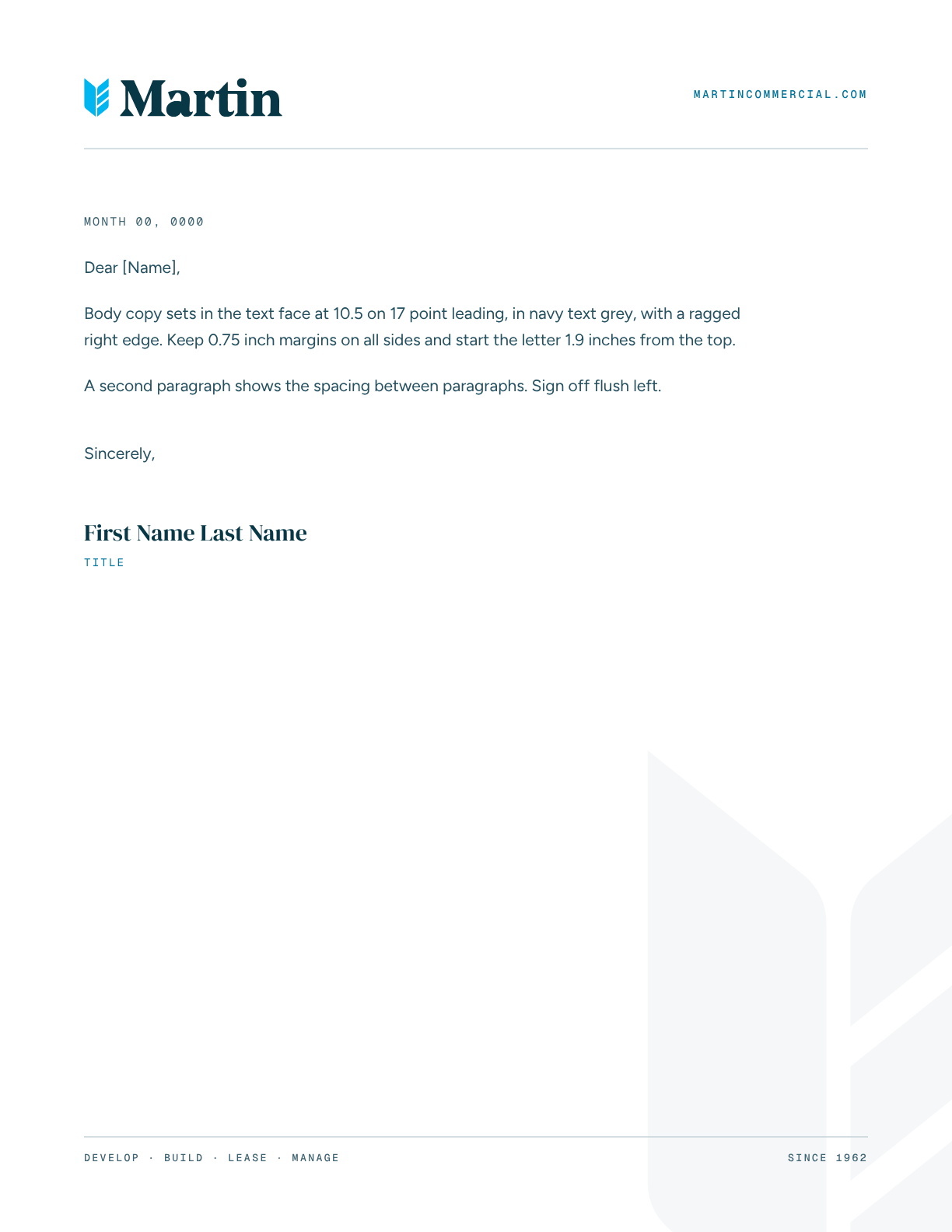
The letterhead leaves the office address out until Martin confirms which address each market prints. For Google Docs: upload the .docx to Drive, open it with Google Docs, then File → Make a copy for each letter.
Sized to each platform, with the logo kept away from where profile photos and buttons overlap. Call backgrounds put the logo top left so it stays visible beside your head.
Plain, confident and local. Martin talks to owners, tenants and investors as “you”, speaks as “we”, and lets the work and the years do the bragging.
Headlines are declarative, often a pair of short phrases. The second one takes the cyan.
Say what Martin does with the four words on the site, in this order.
Dates, addresses and named projects beat superlatives.
Martin is known city by city. List the markets, Lansing first.
Every file on this page, organized by use.